 I'd love to have you all for brunch, but these invites are for my neighbors. Postcards. I spent a good part of the day today screening these and then wonder-undering fabric to cover the paint blobs. But they'll never know.
Then, Marty and I went to another opening of the exhibit,"Breast Cancer: An Artist's View," which is traveling around New Jersey and is in its third location. The space was larger than the previous space, so there were several more artists invited to participate. My piece, "Bad Hair Day" will be traveling again with the show to fourth gallery next month.
 Tonight, going back into the fabric I printed with f.o. yesterday. I think I'm ready to send them off to the guild who wants them as enticements. This one was depressing yesterday but it's better today with a couple more layers, including some foil. Construction fence & sequin waste, screened & stamped, and a foam brush.
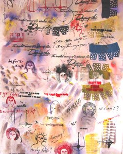
Construction fence, soap thingie, insert from a pencil box, and rubber mat. Then it needed a layer of text, so I wrote all over it. Better.

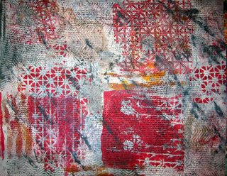
This is more typical of my urban stuff: printed with a rubber mat, a metal grid, and a rubber stamp. I don't remember what else. I may not send this one.
 There's more but I have to get up in 4.5 hours. Good night.


9 comments:
Both. The fabric was dyed and all the surface design is paint.
I really love the one you added text to and the red one...very enticing!
They are all fabulous, of course, but the first two are my favorites. The blue and green in the middle one add a lot of zip to it, don't they?
Good Work!!
Judy
Cool cloth, Rayna. Makes me want to go play....and I *did* have other plans...
very inspirational as always Rayna, love the red one especially, I am going to do some resist methods tomorrow and so I have been gathering 'Rayna style' things to use that I find long forgotten in the bottom of drawer and cupboard,
Enticements to a guild? Are you kidding me?
Well, they are superfantastic. Vibrant and full of energy. I'm really intrigued by the one with the writing. I love unreadable text. I also admire that you use such a vast range of colors and saturations.
Go figure, Sonji. For what I do, guilds are tough customers. Surface design can be scary stuff to people who have never done it.
Awwww Rayna, your stuff is lovely.
Shirley in New Zealand
"Bad Hair Day" is such a cool piece!
Post a Comment