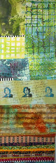
 Oh, did you want to see what it looks like as one piece? Hold on a minute... The weirdest thing is that I keep thinking this looks just like Urban Nightlife, a piece I made several years ago and was sold. But when I looked again tonight, there is less of a resemblance than I thought at first. While some of the fabric is from the same piece, the palette is quite different. So what am I thinking?
I am thinking that it is time to go to bed and get ready for another day. Maybe I will have time to open my new electric frying pan and heat up some soy wax...


3 comments:
You're thinking that it should perhaps be a dyptich... but separated horizontally not vertically??
Vertically into a tryptich??
The Debs are thinking alike again -- my first thought was "how would it look divided vertically into a trytich?"
FWIW, I think it's more interesting as a dyptich than as one piece, and I don't think it looks overmuch like the previous work.
Hi Debs. Not enough space or content for a triptych with the right proportions...but we will see.
Post a Comment