It seems that people who live in tropical climates make art in brighter colors than those who don't. I remember Jette Clover saying she thought her work was so bright when she lived in Holland, but after she moved to Florida her blues were so vibrant that her earlier cloth looked grey in comparison. Fascinating how our surroundings inform our subconscious and as a result, our work.
As I was uploading a few shots from my camera just now, I came across this rather fuzzy picture I shot through the screen as I sat on my mother's porch Saturday night at sunset.
 The next shot, of fabric I printed yesterday, gave me rather a shock.
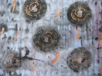 Have you had that experience? I must admit it weirded me out.
On another subject, before I retire for the evening. My cousin sent me an e-mail with a link that is exactly what I needed today. You need it, too.
If you always thought you could paint like Jackson Pollack try this>>>> Jackson Pollock by Miltos Manetas Just remember to click your mouse now and then to change colors. This is FUN!! Enjoy it.


10 comments:
When a local reviewer reported on the "Up Over Down Under" exhibition at Pittsburgh Center for the Arts earlier in the year she remarked upon the "prevalence of orange" in the Australian pieces (see
http://www.postgazette.com/pg/06050/656653.stm for full article). You can view images of the "Up Over Down Under" exhibits at
http://www.atasda.org.au/images/exhibits/uodu/index_uodu.htm
Rayna, this is way too cool. It is a great way to kill time, procrastinate, not think, escape, etc...
Thanks for the link!
Brenda - thanks for the link. It's a diverse and interesting exhibit. But I saw a prevalence of BLUE, not orange. Hmmm...
And Lizzie - I agree. It's a cool way to escape. Almost as cool as reading blogs - LOL.
I'd say your are moving in like-minded circles, Rayna!! Your recent quilts are just awesome!
i first met laura when i took a class from her at quilting in the tetons lotsa years ago.... the piece i started in that class is a mountain scene..in distinctly south louisiana colors...vivid greens etc.
And here I am in Portland, and I think that my color palette may be changing - we shall see - especially when the rainy season hits.
I couldn't agree with Jette Clover more. When I lived in FL, I used brillant colors. Now that I'm in the mid-west with seasonal changes, my pallet is more subdued.
I love the link. Thanks.
Hi
I find that during the winter in the U.P. of Michigan I crave color! Everything is so gray and dull.
Thanks for the fun link also!
I've noticed regional color ways & quilting styles here in Alaska. You can almost tell where a group of quilts came from by the color & style. Anchorage quilters in general like bright jewel tones, like the fushia of the fireweed or the turquois of the Kenai River, where the Kenai quilters go a little darker, & more traditional as a rule ( not every one, but on average). The Girdwood group are Artsy, & wilder (I want to live in Girdwood!)
It's supposed to be something about the light in different areas that actually changes the way colors are perceived. At least I read that somewhere, (I think)!
Post a Comment