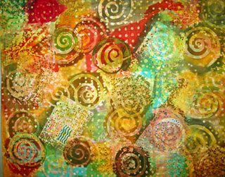
 Here's the scoop: this is a painting called Floating Woods, by a British artist named Gordon Onslow Ford . It is casein on paper on canvas, 42" x 65" painted in 1953. it is in the permanent collection of the Norton Museum in West Palm Beach and when I saw it on exhibit in early May. I would gladly have grabbed it and run for my life if I thought I could have gotten away with it.
To my dismay, the painting was not there last week -- although the others that had been in the exhibit were still hanging in the gallery.
I had never heard of this artist before two months ago and I wonder why not. He died in 2003 at age 90 and was a surrealist in his early years. His style changed over the years; I happen to like his 1950's work the best.Were it a fiber piece, it would need no embellishment as far as I am concerned. Enough stitching to keep it together, but the surface speaks for itself. If this were textile instead of paper & canvas and paint, I doubt that the work would be part of the museum's permanent collection.
This piece speaks to me the way it speaks to Claire, LizzieB, Teri, and others: I don't see chaos. I see order -- but order that has movement, life, and rhythm. To me, it is music. Focal point is the space between the lines -- although I must admit that I'm not big on analyzing focal point. The piece just FEELS right to me. It is a piece I wish I had done.


Oddly enough, before I even knew the painting above existed, I had made a piece early this year that I couldn't make work as a composition. I added vertical lines, much like the ones in the piece above: they looked like lollipop sticks. I turned the piece in all directions. Nada. Would embellishment have saved it? Bleccch. NO! It sat on my wall until I got sick of it and stitched it. But I have never been happy with it: it simply does not work. Potential? Maybe. But potential unrealized. Perhaps that is why Gordon Onslow Ford's piece stole my heart. So, someday I may un-stitch it and cut it apart. Till then, I have learned from it and need to move on.


13 comments:
I'd never heard of him either, Rayna, but I Googled madly to find out more because I was really struck by the image of the painting Floating Woods. He was born the same year as my dad and they would have been at Dartmouth together. Strange. I also looked up the Vallejo - the ferryboat where he once had a studio. There is a wonderful site, full of images, here.
http://www.vallejo.to/
Isabella
All this discussion makes a second point for me- the viewer brings his or her own "stuff" (for lack of a better word) to the experience, and a piece that works from design perspective still may not "speak" to every viewer. I can see the movement and rhythm, I can see the complex layering- but it still doesn't speak to me as other pieces of art do.
I think we need to bring this discussion back to QA because it is so important! At least, I'll post again about them looking here to keep up. Tired of people thinking that angelina fibers thrown on fabric make art. Thank you for posting this, I loved Ford's painting and thought had a suspicion it was a painting all along.
Absolutely, Beverly! For me, this is the best reaason to make work that is somewhat ambiguous: the viewer can bring his/her own 'stuff' to the experience. There is lots of work out there that may get critical acclaim, but it doesn't speak to me either. It's one thing to appreciate work rationally; another when it speaks to your soul.
Isabella - your work is gorgeous.
Hi Rayna,
I see I'm too late to do a "blind" critique -- and I haven't read all the comments on the original post. However, having thought, I have to share my thought....
If I had been the artist who did the (Ford) painting, and if I had done it on stitchable textiles, I would have clarified the spatial relationships through quilting. I would have quilted heavily between the forms. I can't seem to toggle back to the painting, but my memory says that the layering gives a good sense of space -- of things behind things, of a "floating" sensation. Were I to have done the surface design on this, I would have continued on to make that sense of space far more delineated. (And of course I wouldn't have touched it with a single bead, having a visceral dislike of beading). I wouldn't have used contrasting threads that changed the colors of the spacings; I would probably have tried to enhance the postive forms by quilting around them to make them puff up. In other words, I would have changed the rather flat surface and given it, not texture, but a greater sense of space.
I rather like "messy" surfaces and have done a bunch in my artistic lifetime. But in this case, and in spite of the fame of the painter, I actually think, had I been doing the piece, I would have floated that forest more. And it would have been a different piece had I done so.
I guess this is a big reason why I work in stitchable textiles -- the stitching makes a world of difference. You can like or dislike the difference, but the difference is palpable.
So them's me thoughts, take 'em or leave 'em. And I'm going to go back and look at the painting again.
cheers, June
It's me again, June (not anonymous)
I looked again and read the comments. Like many of your viewers, I don't find the piece cluttered at all (I perhaps didn't make that clear in my comment). It seems orderly in its floated elements. I like the piece a lot, but I think, I just think, in my 'umble thinking, that it could be even more wonderful if it were done in stichable textiles and quilted. How's that for heresay.
You would have to keep the severe rectilinearity of the whole (no wonky shaping)and dealing with the far back background could be iffy, but I think it would be great fun to try. The "if" again -- if I were to have done this, I would probably have made those lovely white lines that float in and out, out of stitching, even out of (gasp) big hand stitches. The machine quilting would be done with the intent to flatten yet texturize the negative space and to puff out the positive. It might make the circles too prominent -- couldn't tell until I tried it.
In fact, I'm tempted to print this on fabric and see what would happen to it if it were stitched. The scale, though, would be lost and that would change things also. I think in its original size it would be eminently stitchable, but at the size of a printed copy, it would lose that scale. This reminds me of Joan Mitchell's work, done at the same time. She's more wild and painterly, but the same sense of floating and ordered chaos comes through.
Ok, I'll quit now. Gee, I wish we could pursue this further, in the studio, with the piece blown up large in front of us and each of us with a small sample to try out our various ideas. Terry could change the orientation, I'd stitch within an inch of its life (around and between, of course). Rayna would sit in awed silence.
cheers, June
I like the new one you posted today. The colors, the circular designs, enough interest, but not too busy.
How funny, Rayna! The very similarity of the piece to your style and elements made me wonder if it was, indeed, a "ringer"! And I suppose my plan to turn it on its head seems like real heresy now that we know it is by someone sort of "famous"--but I still think I'd like it better that way--but only slightly. I like it a LOT as it is.
The comparison to your new piece is most striking in the similarities, but also points up that your piece is not so "composed" as the painting is. Yours could be a randomly cut piece from a larger all-over patterned fabric. This is something I have seen in your work before and probably why I have liked your work that brings pieces and other elements together more than the wholecloth work.
What an eye to have found the Ford piece--you are certainly soulmates on some level.
I agree with Beverly. The piece doesn't "speak" to me.
However, I am wondering if seeing it "in the flesh" might make a difference. Surely, at the size intended for viewing, there would be more space--more places for the eye to rest.
Someone asked Rayna if she couldn't have just a slice of the piece, and I can imagine ways in which to use parts within a totally different design. But, it's still not a work of art that holds much interest for me.
What's up next, Rayna?
Sharon Richards
The energy here is making me sooo happy - I need every spark you are sending out. Will be happy to get home next Sat. and maybe - maybe - back to my studio for a bit.
- Sharon - I don't know what's up next. Start something! I'm out of steam - LOL.
- Terry & Shelina - my piece is whole cloth, wax resist & dyes - with a couple of elements added.
Interesting, what holds interest for each of us: I don't like photorealism, but Edward Hopper moves me every time. It's the ambiguity in his pictures: as if you have come in in the middle of something - and there is a story there, but you don't know what it is. Love that.
I need to take a picture of this palm tree outside the window as the sun is setting. Oh, trite!
Thanks for your feedback.
Hi Rayna, What a great topic! I just surfed here from Diana's blog. When I first saw the painting I thought it was actually one of your printed textiles. So I wasn't suprised to see that you had made a piece with similar elements in the past.
I like the colours in the painting and I like the use of layers. Most of all I like the thick lines (or sticks as I thought of them). I like that the painting has a sense of depth. So I think I can safely say that I like the painting :-)
A lot of 'art quilts' suffer from lack of intent or if there is intent, lack of time spent in design and development. I have been guilty of this at various times and have almost always disliked the outcome.
Sometimes I think that if someone wants to call their art - art then just let it be, I think it is wonderful that people are getting to it and being creative (rather than wasting their lives in front of the tv) even if it means just chucking angelina fibres around, after all - most of us probably started from a similar point.
However, I also like to see people striving for excellence, I like to see work which is well designed and shows that there was a thought or two in the artist's head. This is the sort of work I love to look at and try to make :-).
Well, you fooled me. It is so similar to your work, I thought you had done it. I love it, still. I like June's take on the stitching. Now when I look at this again(thanks for the pop-up comments window), it is an assemblage of 3 basic shapes so simple, yet so effective.
To me this image is a reflection in a pond with raindrops and/or waterbugs layered on the surface. My eyes see the surface of water and also the elements below and above that surface. He has played with the values - light recedes/dark comes forward - in such a way that they defy the standard usage. If this piece were done in textiles a lush surface of stitches and layered fabrics would enhance my enjoyment of seeing it in-the-fabric. Some of Rayna's pieces exhibit this multi-layered appearance, so I can understand why she loves this painting. So do I! Del
Post a Comment