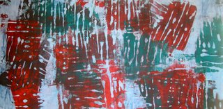
 I was pretty pleased with most of the pieces I printed today: the result of something I've been experimenting with and am still exploring. This is printed on one of Ms. Closet's beauties, which seems like a waste to me. I really need to dye some of my own fabric and then print on it. I brought some dyes to the studio but really can't use them till the hot water heater is connected. Maybe by the end of the week? We shall see. In the meantime, I will continue to work with paint. To get hot water for washing my equipment, I use the electric kettle -- but it is a short-term solution.
 These last two were attempts to use up bits of paint rather than throwing them out. I used my Thermofax screens to add another layer to some unsatisfactory fabric. This one - text over construction fence and who-knows-what else - is typical. Guess I can't get away from it.
 This one, the last of the day - what was I thinking when I made this leaf screen? Time to go home after that.
 Tomorrow, I hope to get to the studio sometime in the morning. But of course, that means getting up early. NOT a happy prospect.


5 comments:
I like all of these but my favorite is the one with writing!
I don't know what you were thinking, Rayna, but the last one has the strangest textural effect...as if looking right through the cloth. Cool!
YOu are so hard on yourseld. Most of us would love to have your not so greats!!
Rayna, I am also drawn to your leaf print, and think that if you were inclined to cut it up and reassemble it, you might find some very interesting symmetries to exploit.
It may not be what you expected, but there is depth and contrast enough to carry it.
Rayna I agree with Gerrie and my fav is the blue/green with writing on,
Post a Comment