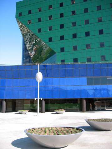
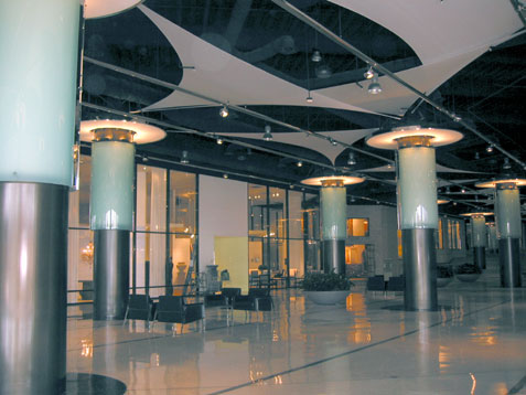
The official name of this building is the Pacific Design Center (similar to the D&D Building in NYC but much more gorgeous. The people of L.A. refer to it as the Blue Whale (although there is now a green part) because when it was built, they hated it. Here is a picture of the interior when you first walk in. To-die-f0r furniture and everything else you might want for your house (in your next life).
Here, in one of the windows of a ritzy design store is a carpet that I thought had wonderful graphics. Couldn't resist the picture - although the color is undoubtedly off.

A branch of the L.A. MOCA (Museum of Contemporary Art) is adjacent to the Blue/Green Whale, so we walked over there to see the eight Rothkos. My cousin Nancy (with whom I am staying in L.A.) is taking an art course where they go to different museums and galleries every week and the professor talks about the art. I'm not sure what he said because I was too busy trying to look at the art and block out his loud voice so I could communicate directly with the work. He was yakking about how depressed Rothko was (he eventually took his own life) and that the work reflects this. Blah blah blah. The first guard said I could take pictures without flash; her replacement almost arrested me when I took a picture. On the other hand, there were no ropes or alarms and you could practically get your nose up to the canvas. That was great.
I haven't seen a lot of Rothko's work in person: certainly not eight pieces in one small place. What a difference it made, seeing them together and having the time to get very close. If only that professor would have stopped talking. 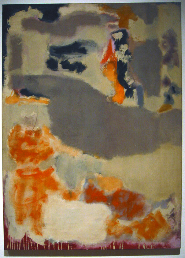


2 comments:
I visited the Tate Modern when I was in London last year (www.tate.org.uk/modern). They have Rothko's Seagram series on permanent exhibition there and it was very interesting to see these brooding quilts all together.
Whoops - Freudian slip. Of course the Rothko works are painted murals not quilts...
Post a Comment