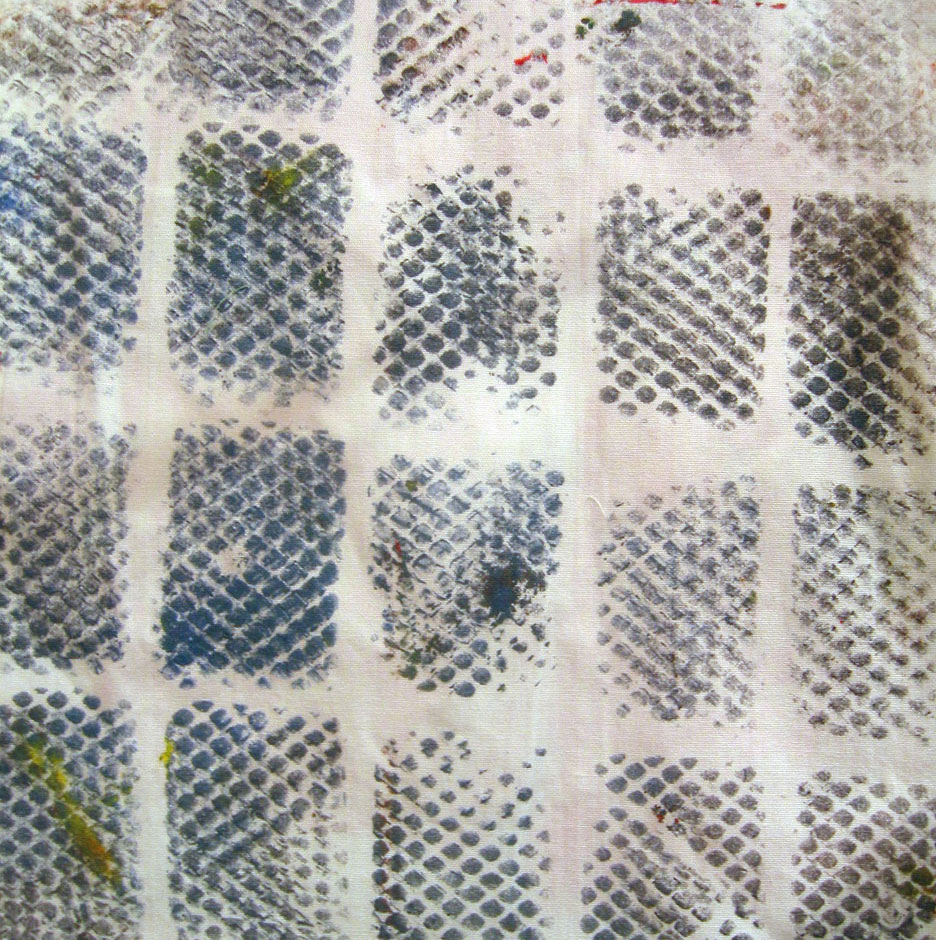
 Nothing to write home about, so I added a layer. I mixed Golden acrylic copper paint with Golden's GAC 900, which keeps it from being too plastic-y and changing the hand.
 And since I generally don't think a piece is complete unless it has some text, here we go.
 I think it's done -- at least for the moment.


5 comments:
Definitely an improvement! (Of course, I think the color copper can make anything gorgeous.) I like the contrast of the geometric background and the organic additions, and the copper/steel blue combo. And if you are still unhappy with the fabric, I'd be more than happy to take it off your hands... ;-)
Well that has certainly brought that piece to life. You'd never know it started life so bland! And you've pushed me into adding copper to my Golden range!
I love this, the additions really make this piece. Now, I really want to take a class with you. It seems that's what's calling me now.
Wow, you really enlivened that piece! Is it instinct or years of training that tells you what to add next and where?
I'm thinking about getting some Golden paints after hearing wonderful things about them. Do you know of a good source? Michael's doesn't seem to have them and I'm unfamiliar with art stores or catalogs...
see my next post for my comments
Post a Comment